The Island Lodge Hotel Booking


Overview
The Challenge: A new boutique hotel needs a website. Their top priority: making sure customers can easily book rooms online.
The Goal: How might we best design a mobile website for this hotel, so that the room booking process is as smooth and quick as possible?
My Role
I was responsible for all research, design, and prototyping.
This was an individual academic project as part of my Professional Diploma in UX Design.
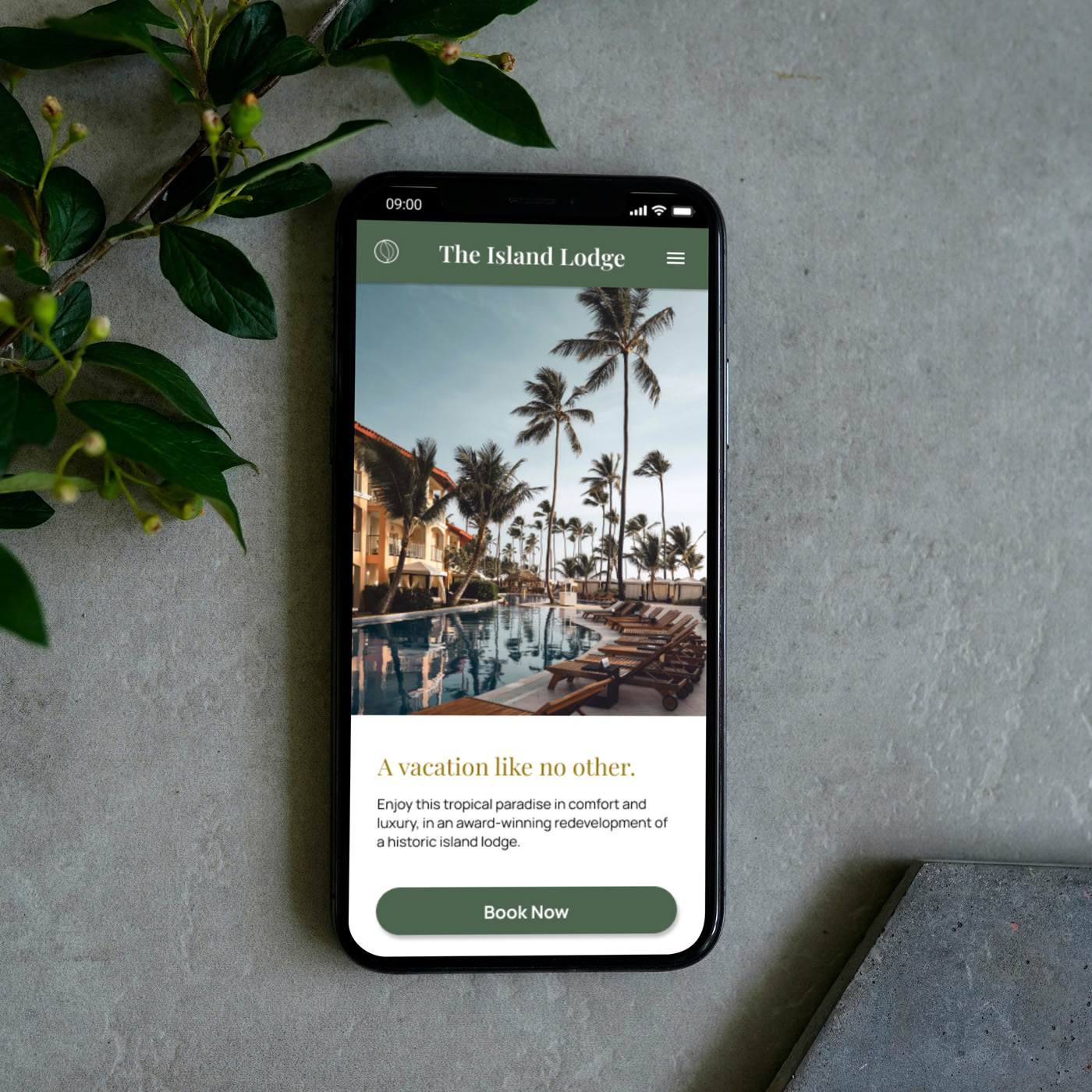
Try it out for yourself!
Try out the interactive prototype here, booking a room for 2 adults, from 15-18 July.
The Hotel
As this was an academic project, I came up with the characteristics of a fictional hotel, named The Island Lodge.
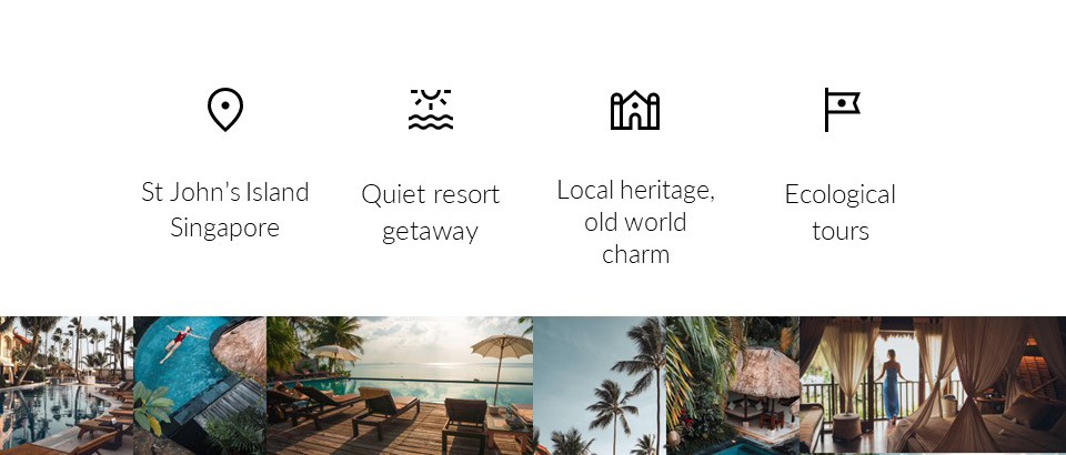
A historic refurbishment of four existing campsites on St John’s Island, Singapore, the hotel offers quiet luxury, local heritage, and old world charm, complete with educational ecological tours for the discerning traveller.
Research Overview
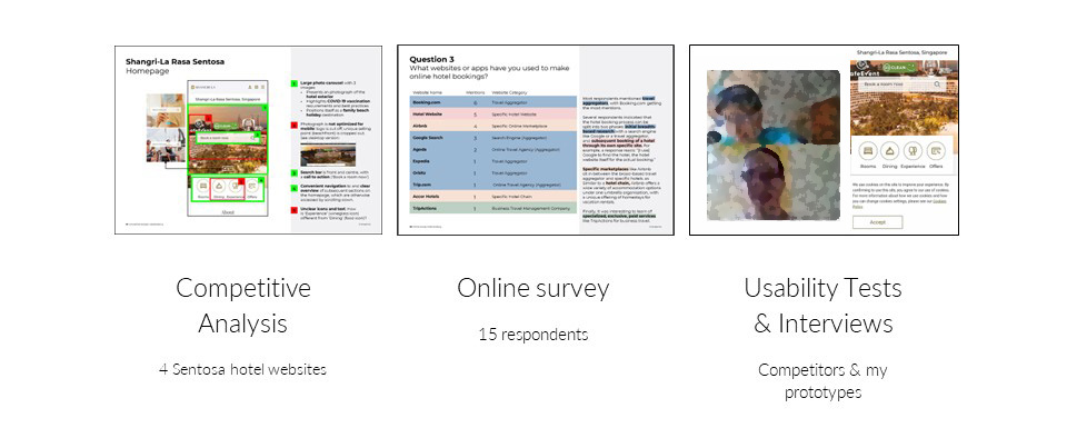
To find out best practices and pitfalls to avoid, I first conducted a competitive analysis of 4 Sentosal hotel websites. I then sent an online survey to hear firsthand about people’s experiences with booking hotels. Finally, I conducted usability tests & interviews to gain an in-depth understanding of user behaviour, using competitors’ websites first and my own prototypes later.
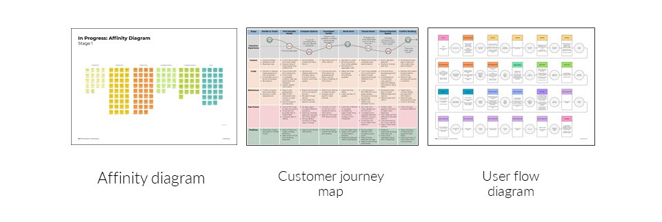
Armed with lots of unstructured data, I used affinity diagramming to group my research findings into logical themes. Focusing on the user’s perspective, I made a customer journey map of the entire hotel booking process, which was then translated to a user flow diagram, depicting a happy path for the hotel booking process across 10 screens.
Expand for more detail on each step of the research process!
Competitive Analysis
I analysed the mobile websites of four competitors - The Shangri-La Rasa Sentosa, The Barracks Hotel, Amara Resort Sanctuary, and Capella Singapore - with a particular focus on their hotel booking process. Read my 25-page analysis of the first two hotels here.
4 Pitfalls to Avoid:
- An overwhelming number of options that are not significantly different from each other
- Inconsistent typography and formatting, a lack of visual hierarchy
- Images that aren’t optimised for mobile, and inadvertently cropped badly
- Walls of text
4 Best Practices:
- Constantly updated prices at every step
- Clean modal pages for microtasks such as date selection
- Collapsible sections that save screen space and implement progressive disclosure
- Filters that mitigate a large number of options
Online Survey
Though respondents were limited to family and friends, this was a valuable source of insights about users’ goals, behaviours, and pain points. Read the full report on the survey results here.
4 Key Takeaways
- Breadth, then depth. Users conduct their initial breadth-based research with Google or a travel aggregator, compare options, and finally book a hotel, often through its own website.
- Finding and comparing options were the most time-consuming processes. Hence, tools that helped - such as filters and map views - were very much appreciated.
- Price savings and flexible cancellation policies were the most important things that users looked for.
- Hidden fees were by far the most common source of frustration.
Usability Testing
To see how real-life users interacted with existing mobile hotel websites, I conducted a usability test with the Shangri-La Rasa Sentosa website and The Barracks Hotel website. I saw firsthand that browsing was an important part of the booking process, as users naturally wanted to see what the hotel had to offer.
4 Key Takeaways
- Browse first, book later. The browsing and booking processes should be smoothly connected.
- Pricing structure needs to be clear and upfront.
- Difficulty in comparing many different room and payment options leads to frustration.
- Avoid information overload: “Because there are too many words I’m not going to read.”
Analysis
Affinity diagramming was used to synthesise the findings from all these research methods, generating a 10-step hotel booking sequence as well as general notes about best practices, content, and layout.
Explore the final affinity diagram and customer journey map. All quotes are directly taken from research participants.
5 Research Takeaways
Breadth first, then depth. Users would first conduct a broad-based search for hotels with travel aggregators, and then book directly from individual hotel websites. By contacting hotels directly, they hoped to get a better price, the most accurate and updated information, and increased customisation options.
Browse first, book later. Within a single hotel website, users engage in an exploratory browsing process first, finding out what the hotel has to offer, before switching to the linear booking process.
No hidden fees. Hidden fees were repeatedly mentioned as a huge pain point.
TL;DR. Information overload frustrates users and delays decisions, especially when it comes to tbe most crucial point: payment.
Is this for real? Unique to online bookings, users need reassurance that there are real people on the other end. Users want reliable information as well as a personal human touch.
This led to the following 3 design goals:
🎯 Design Goal: Increase Clarity
TL;DR: Show only the most relevant information. Implement progressive disclosure. Smoothly connect the browsing and booking processes for an intuitive booking experience, leading to better conversion rates.
🔎 Design Goal: Increase Transparency
Implement price transparency at all times. Automatically calculate and update prices to facilitate user decisions.
🤝Design Goal: Increase Trust
Empower users to contact the hotel directly. Reassure visitors with reviews from trusted external sites and a robust social media presence.
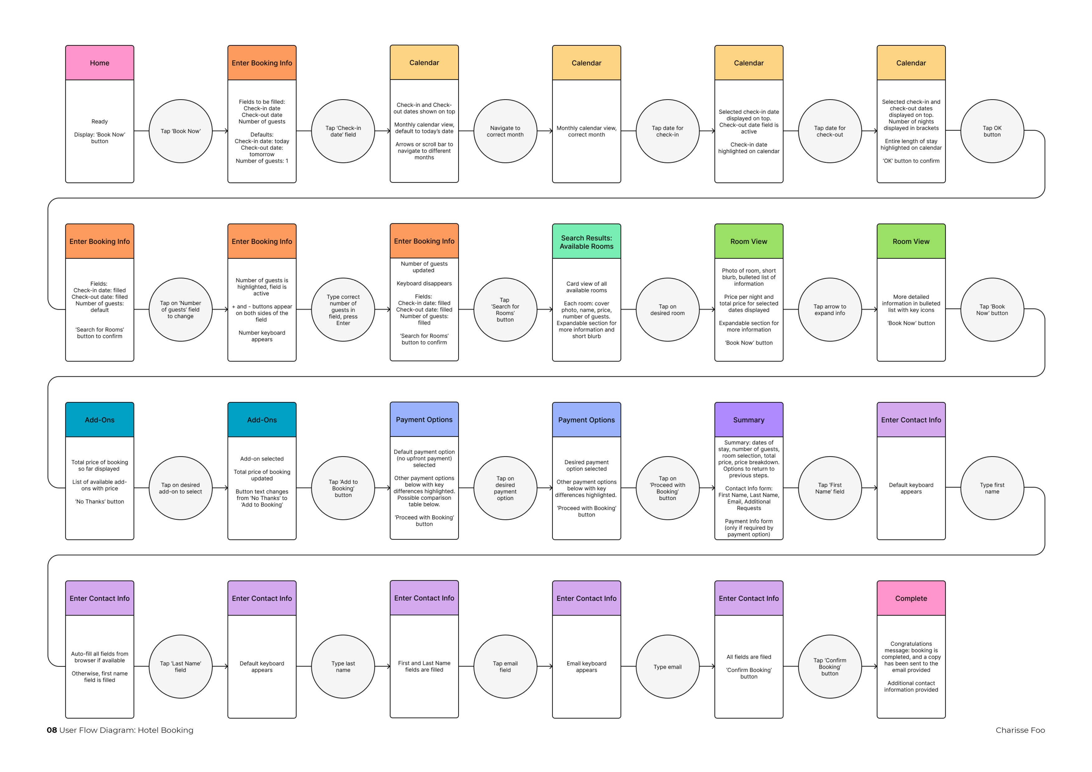
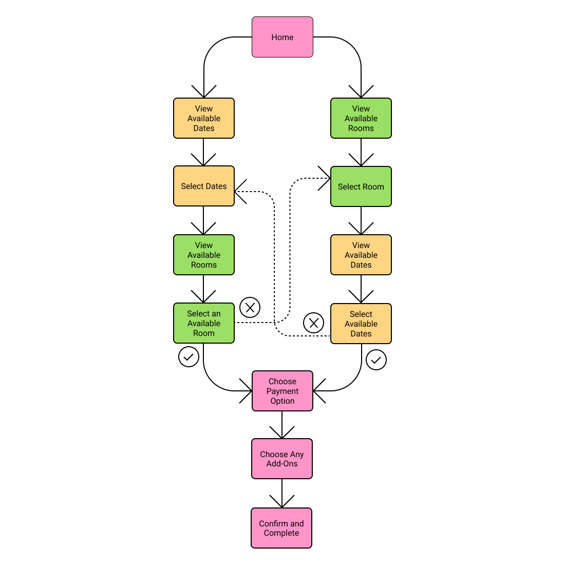
User Flow
This primary user flow brings users across 10 screens. For users who have concluded their browsing - they enter their dates of travel and select rooms they’ve already decided on - this should take no longer than a few minutes.
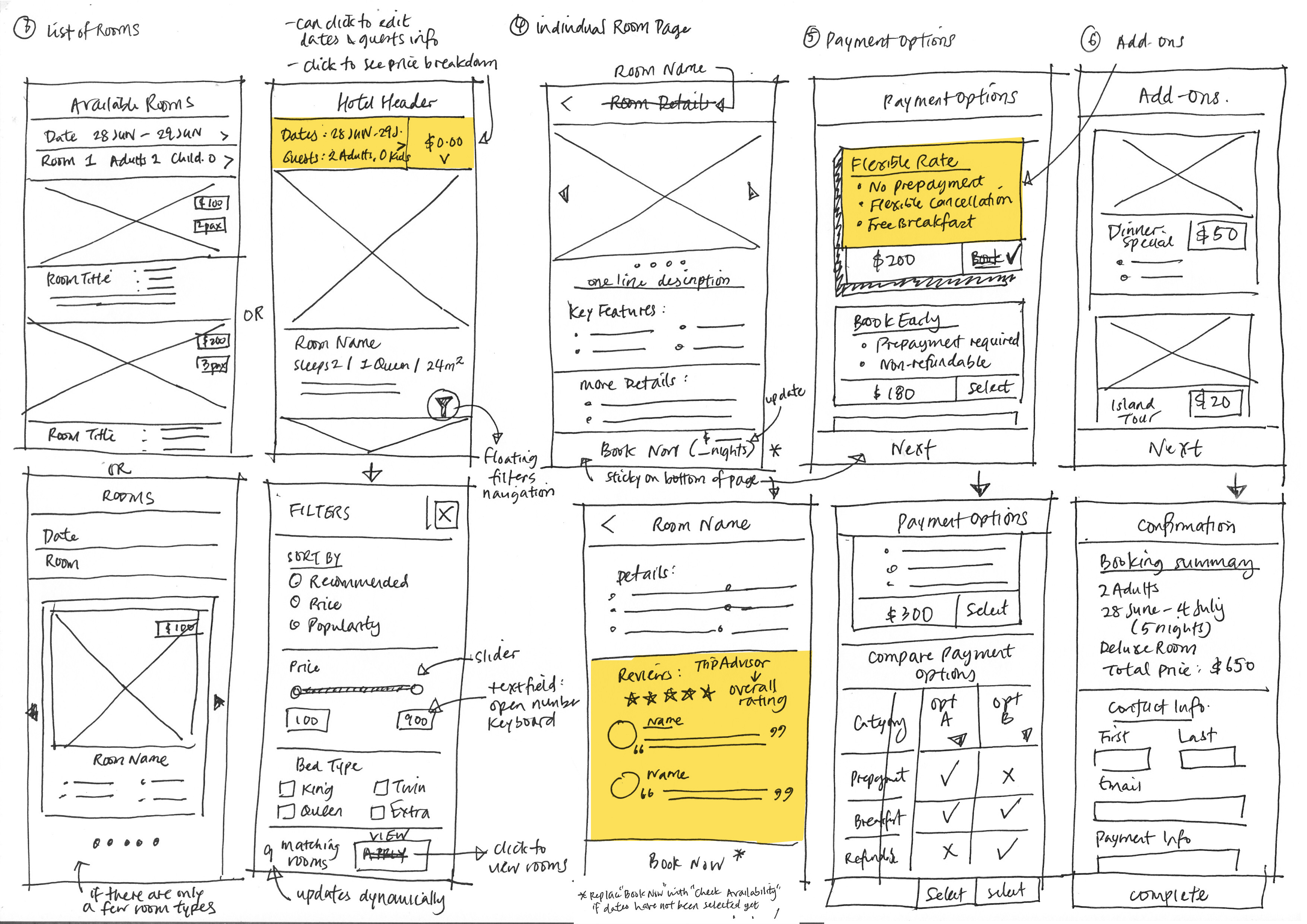
Wireframe Sketches
Several important design features were already contained in these sketches:
- a sticky header with constantly updated price and booking information (transparency)
- external reviews (trust)
- concise summaries for each room and payment option (clarity)
Medium-Fidelity Prototype & Usability Testing
Key Takeaways:
- Visual content is key: actual images made it a lot easier for users to interact with the prototype and understand the content that was on the site. All images used are freely usable and obtained from Unsplash or Pexels.
- Sign In/Sign Up: I had prioritised the ability to complete the hotel booking as a guest, but user testing conveyed the desirability of a membership portal for easy retrival and management of their hotel reservations.
- Large tap targets on mobile are needed
- Specific areas where layout can be clearer, copy can be refined, and digital affordances made stronger
Design Iterations
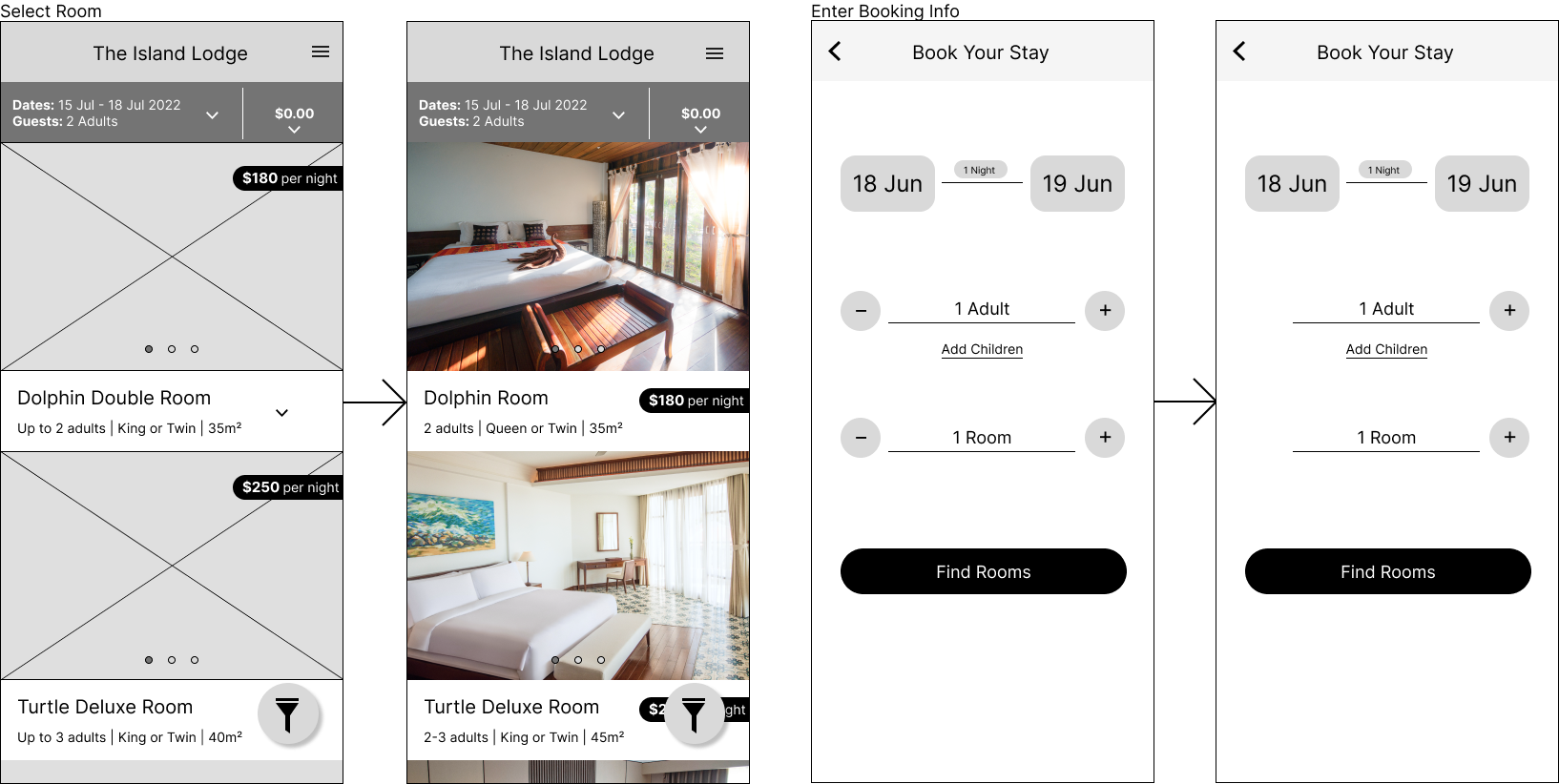
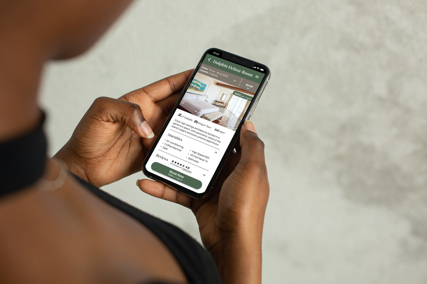
Problem: A user was confused as to whether the price and photo applied to the room above or the room below.
Response: The price is now displayed after the room name, as the user expected. Clicking anywhere in the room title area will bring the user to the individual room page.
Problem: It did not make sense to allow a ‘0 Adult’ or ‘0 Room’ booking.
Response: When the number of guests or rooms is at a minimum of 1, the ‘-’ button disappears.
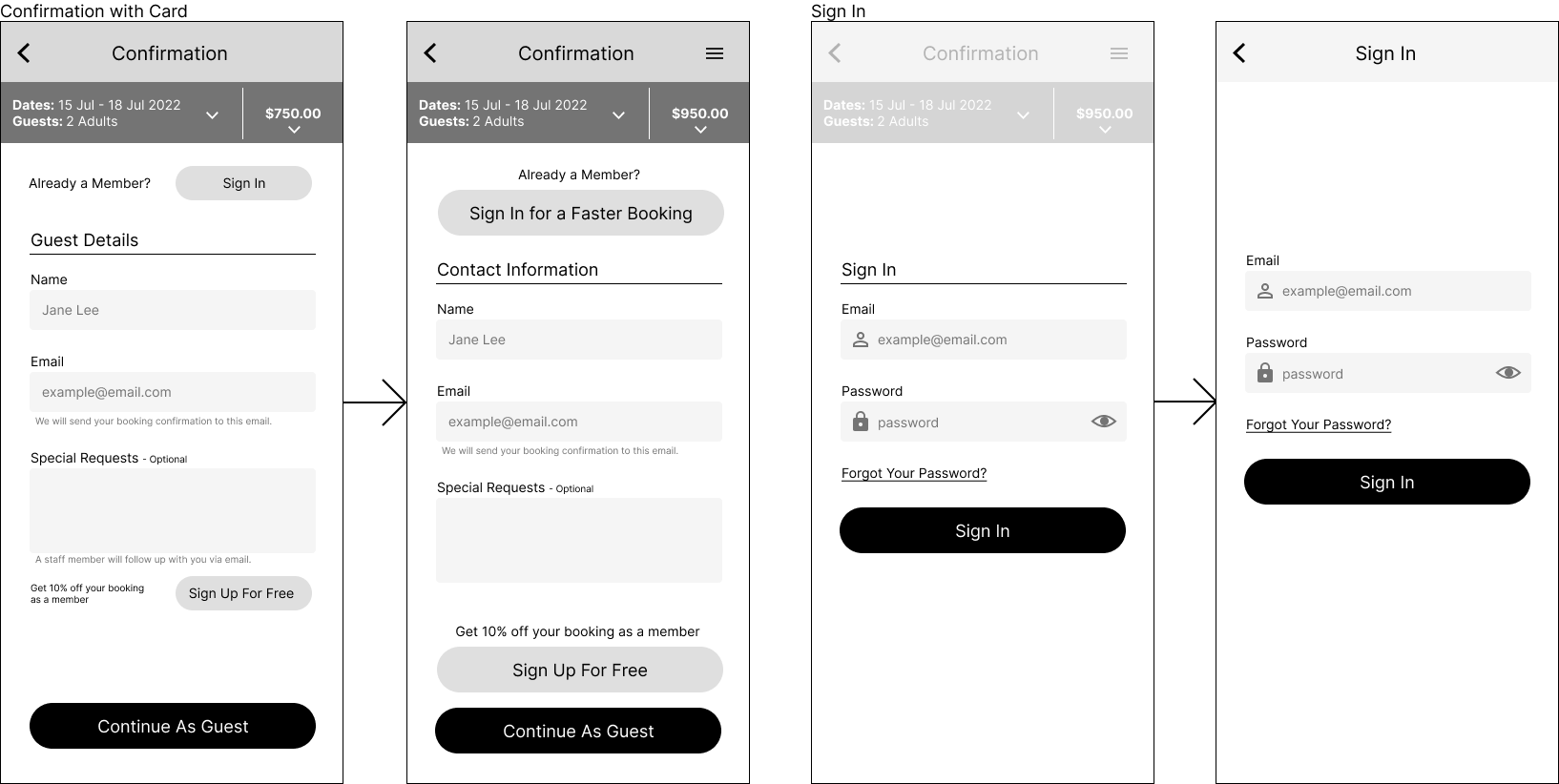
Problem: Users were equally interested in the ‘Sign In’ or ‘Sign Up’ options as they were in the ‘Continue as Guest’ one. Not all requests need follow-up.
Response: Buttons were standardised in size and alignment, allowing for greater visual consistency. The line about necessary follow-up was removed.
Problem: Making the ‘Sign In’ screen an overlay over the previous screen increased visual clutter. There was potential confusion regarding the grayed-out back button.
Response: The ‘Sign In’ screen is its own screen, and the page title and back button are consistent across all screens.
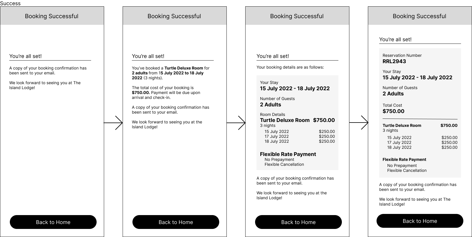
Problem: A summary of the booking details should be presented legibly, with details such as a price breakdown and reservation number.
Response: More information was added and differentiated through visual hierarchy.
Visual Design
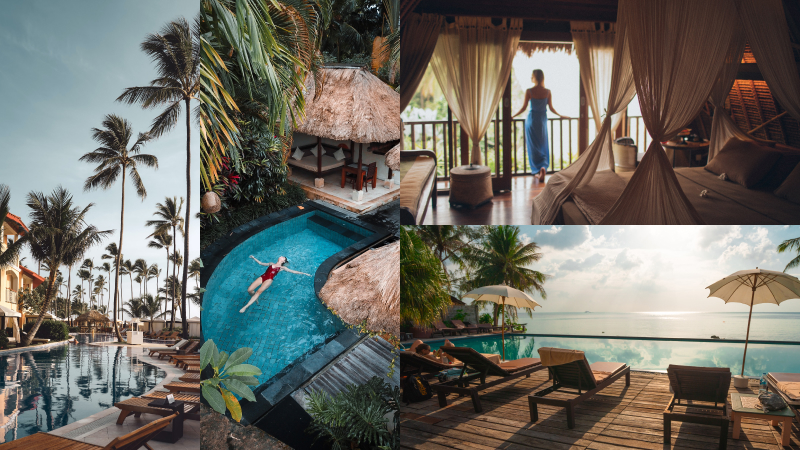
Mood images provided inspiration for the visual design. Since The Island Lodge is a high-end beach resort, I went for warm earthy tones, a primarily dark, muted palette, and serif headings to convey a sense of timeless tropical luxury.
In this style guide for typography and colour, the dark primary green evokes lush tropical vegetation. The light colours are used for pages with specific microtasks, such as date selection, before the user returns to the darker ‘home’ colour palette.
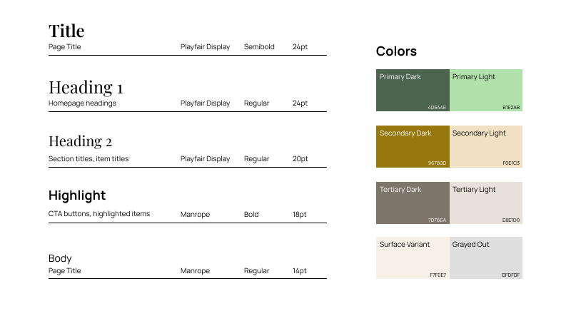
Knowing that yellow and green are a common set of confusion colours when it comes to colour blindness, I tested the colour scheme for accessibility to people with colour blindness and made adjustments.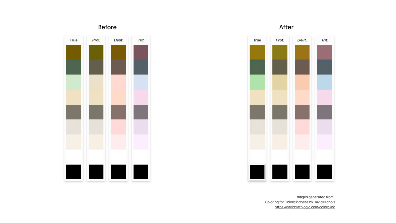
High Fidelity Prototype
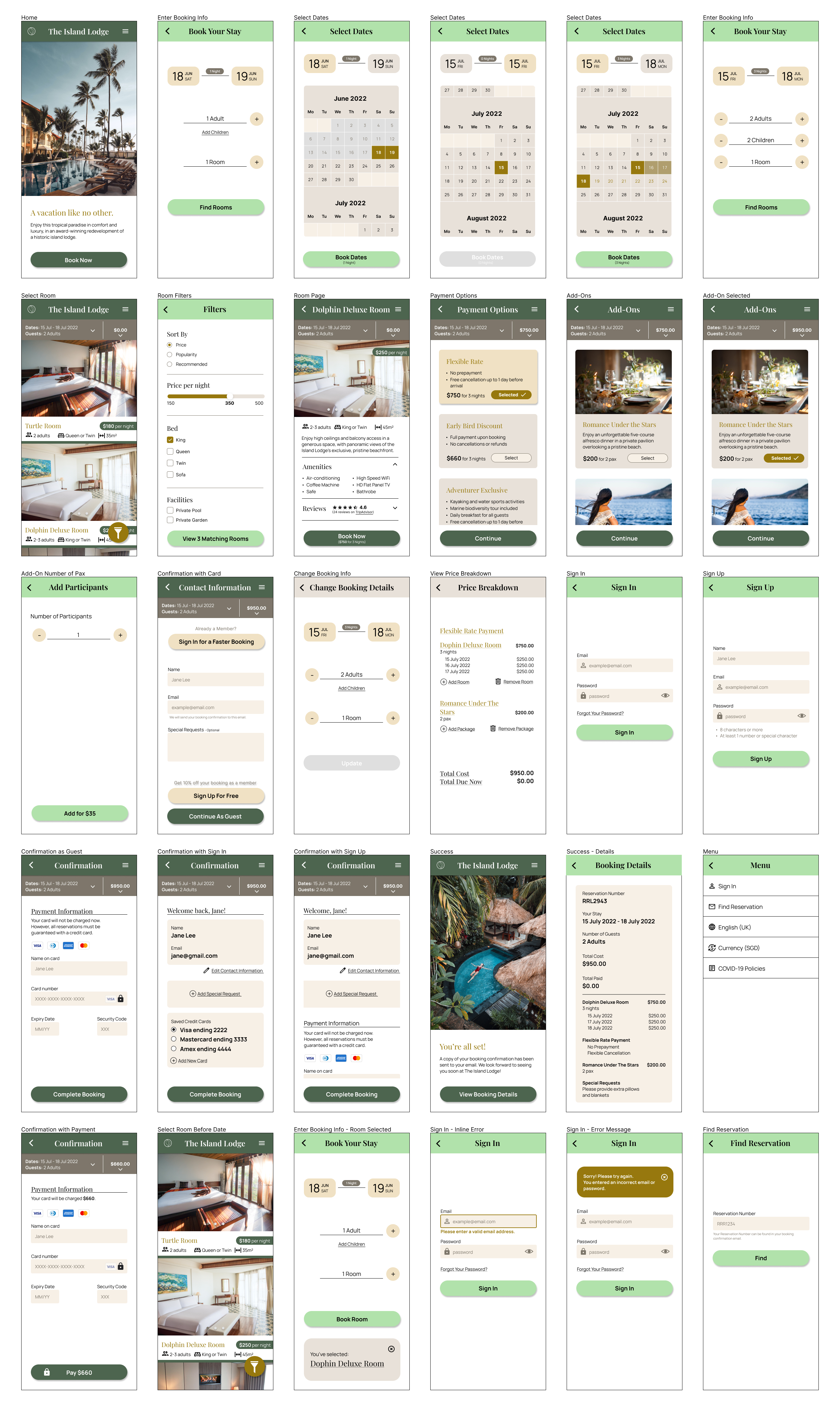
These wirefames are the basis for the high fidelity prototype shown at the start. Besides improvements to copy and content, I designed additional screens to facilitate the secondary user flow where room selection occurs before date selection. Designs for error states are also included.
Design Iterations
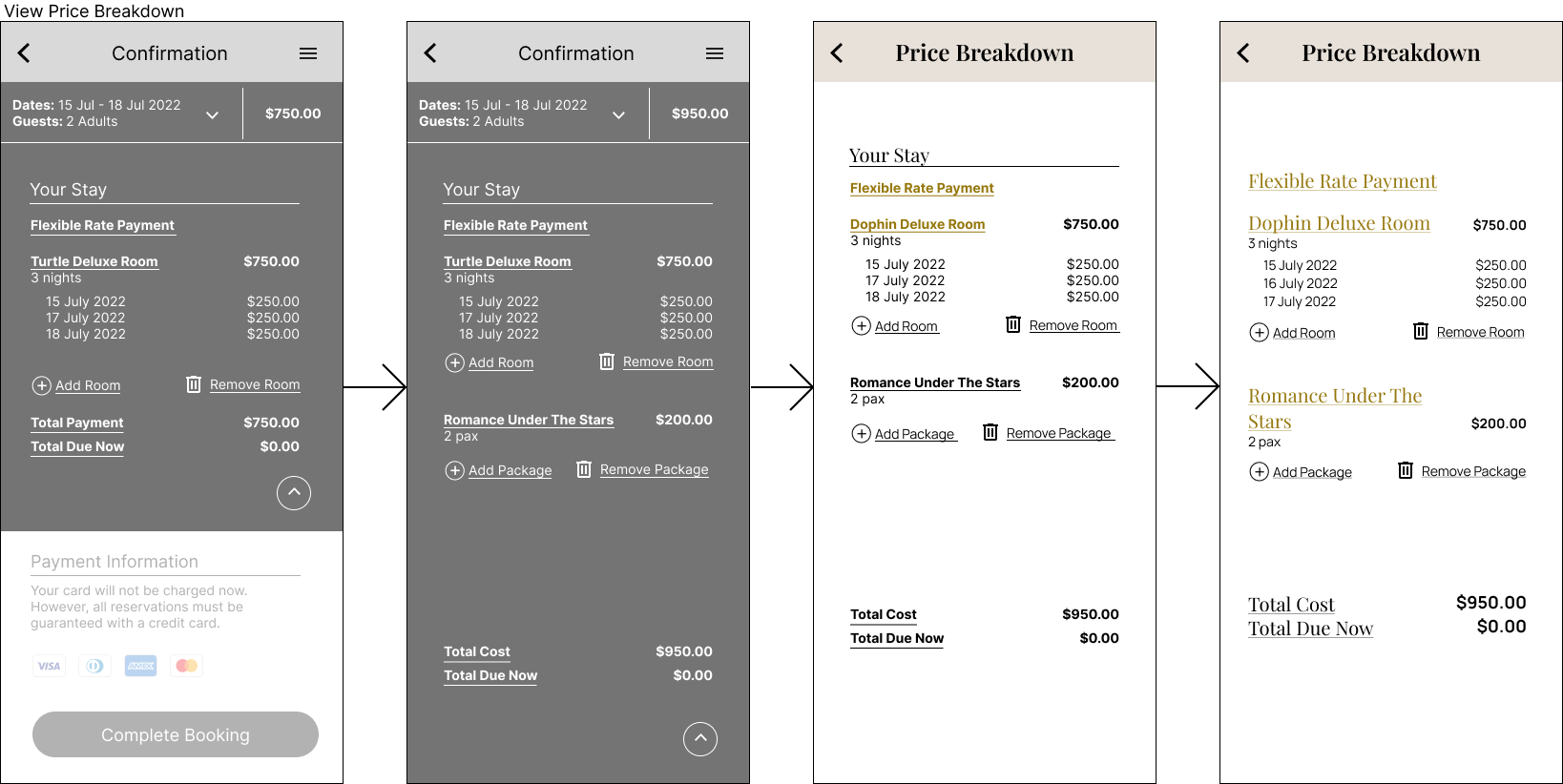
As price transparency is very important to users, and there is a lot of information presented, I expanded the price breakdown screen from a modal dropdown to a separate page.
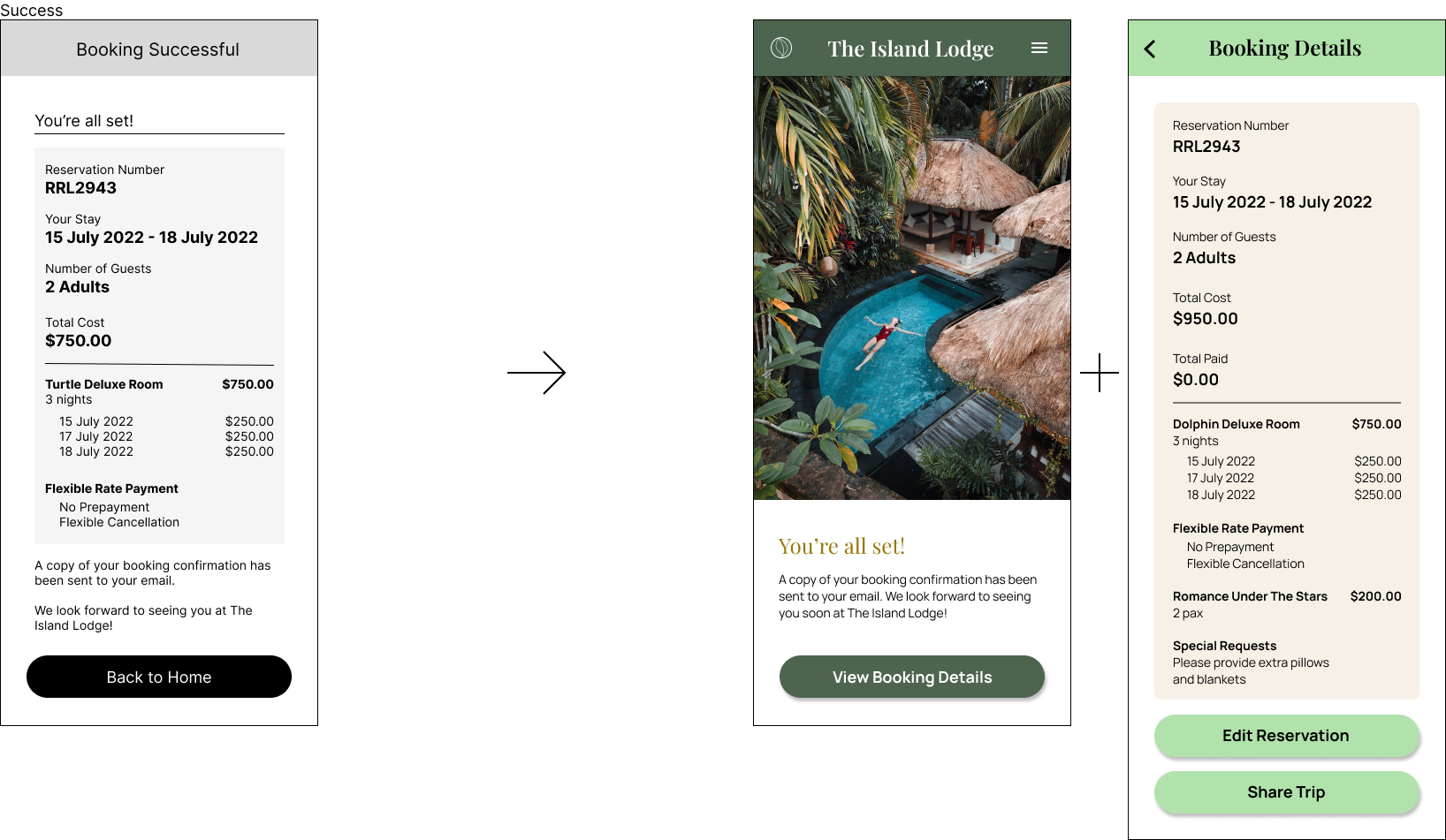
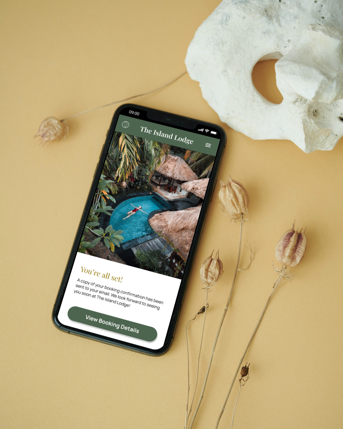
Similarly, I split the final success screen into two, to properly congratulate the user for completing the booking process with a splash image, and give the all-important booking details sufficient space on a separate page. The ‘Back to Home’ button was also replaced with more useful functions of editing the reservation or sharing the trip with friends and family.
Design Annotations
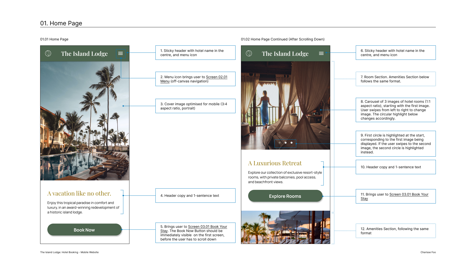
To wrap up the design process, I produced these design annotations as handover documentation for developers to build the website accurately. The full 18-page document can be found here.
Design Feedback
“The prototype functions very well, it was easy to get through, easy to understand and very pleasant to look at.”
Further Exploration
As this was an academic project, a significant next step would be to integrate real-world hotel information, which often has a much higher level of complexity: many more details regarding payment, hotel policies, terms and conditions, health and security regulations, just to name a few. Working with a client with an existing repository of information to be presented would add complexity to the design process.
Since I chose to focus on a mobile website, a separate desktop version would also have to be designed. I’d also sketched out a comparison feature for different payment options if the hotel absolutely needed to offer many different options.
To further expand the scope of this project, I’d integrate this particular hotel into a larger hotel group, which manages several hotels across different locations. This is often the case with large hotel brands such as Four Seasons or Shangri-La. Each hotel would have its own identity, but be linked to the larger brand ecosystem. I’d expect this to make the booking process more exploratory and complex, with greater importance placed on brand loyalty and membership privileges.
Learning Points
Going through the entire UX process from research to analysis to design was highly enriching and educational. I especially appreciated the insights gained through usability testing - nothing challenges or validates a design as much as seeing someone completely unfamiliar with it interact with it for the first time.
Technically, I thoroughly enjoyed learning Figma from scratch through this project. I’d like to delve deeper into user interface design with grid systems for screens that are pixel-perfect, and visual design by developing a strong brand identity.