Jewellery Ecommerce on Mobile


Overview
I worked as a freelance product designer for a local jewellery store.
The business owners had just opened a new physical retail store. As they’d had success with social media sales in the past, they wanted to formalise their expansion to the online market through a native mobile app.
The Team
I was the sole designer, working with:
- 1 freelance developer
- 2 business owners
My Role
I led the design process from discovery to development, and managed communication between the developer and business owners.
In addition to design and project management, I was also actively involved in streamlining internal processes, automating inventory management, and undertaking product photography.
As the app is currently in active development, what follows is a highly condensed case study.
Business Goals
There were 2 business goals for the app:
- Increase sales
- Build customer loyalty
These goals were shared across the app and the physical retail store.
Information Architecture
To get the client and development team on the same page, I made sitemaps outlining the project scope.
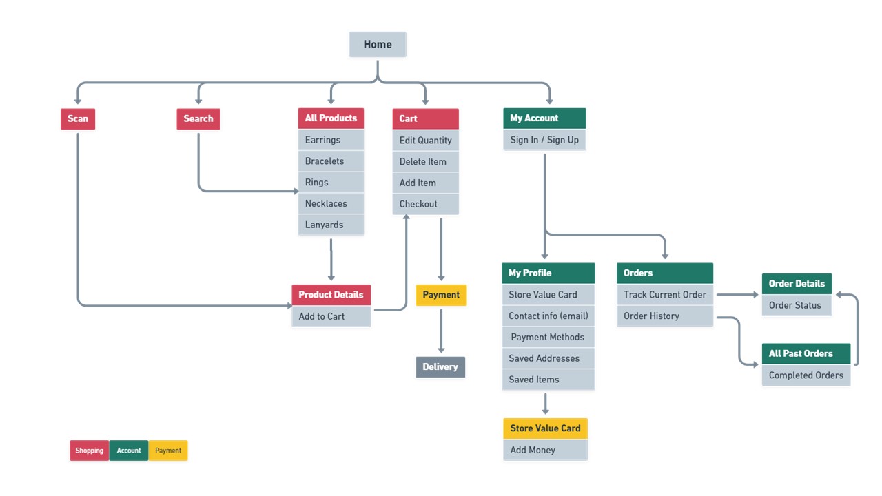
After two rounds of discussion and iterations, we’d agreed on this sitemap for a minimum viable product.
High-Level User Flows
In outlining the main user flows to the business owners, I focused on the two ways that the app would generate revenue:
- Customers buy jewellery remotely.
- Customers buy or top up their loyalty card.
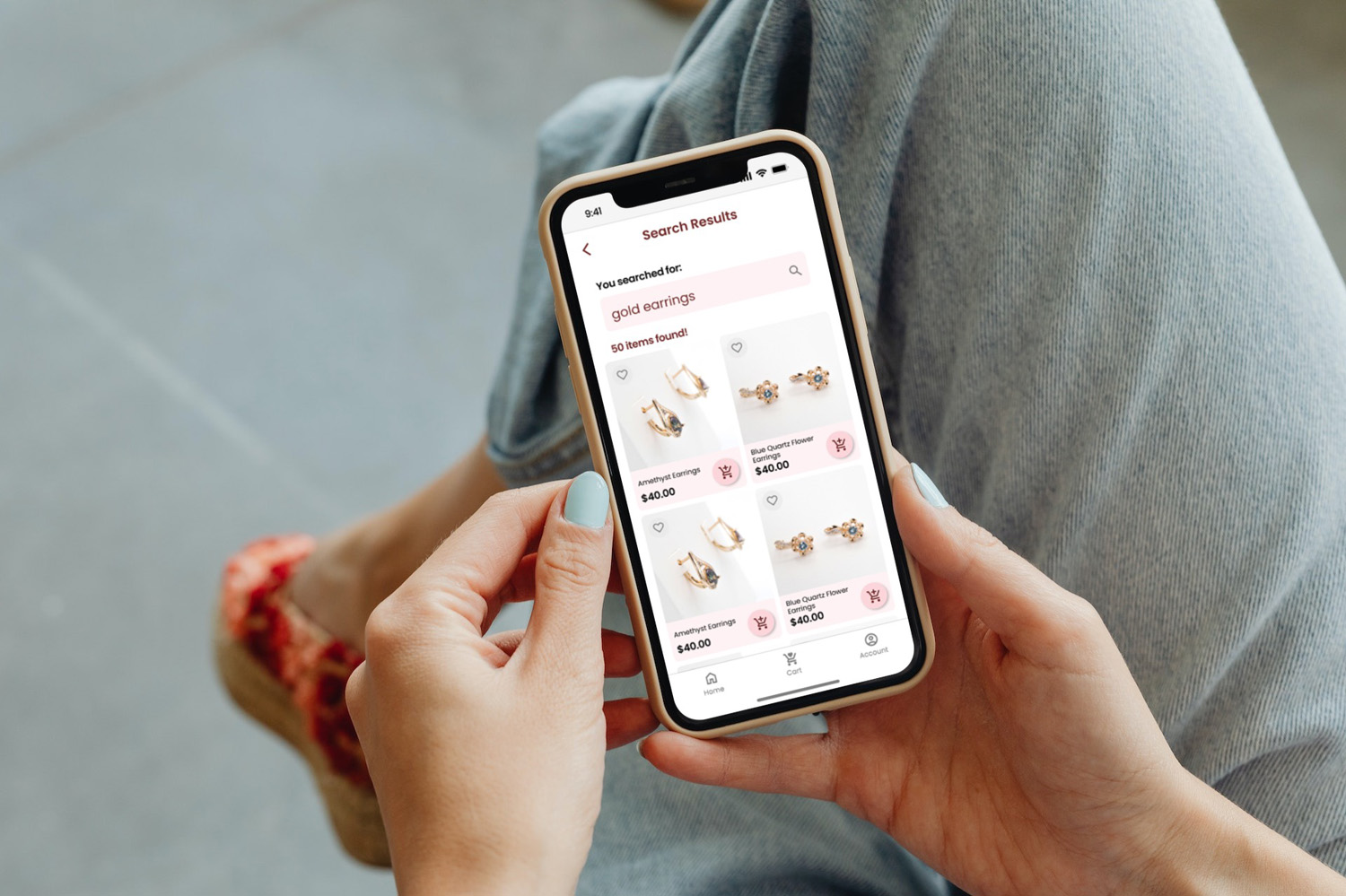
The first was the core functionality of a shopping app: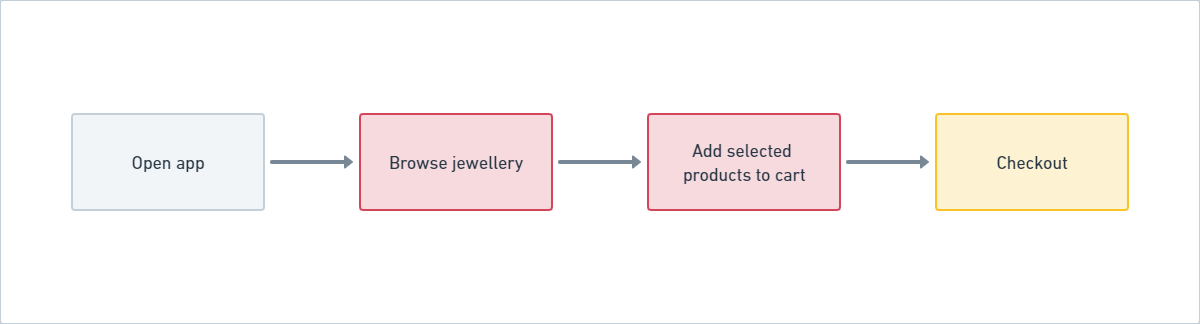
The second was the groundwork for their existing loyalty and rewards system, to be expanded in future phases: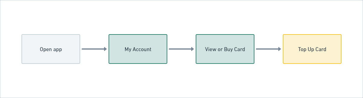
User Flows
As loyal, returning customers were a core target audience, I wanted to make sure that the app catered to heavy users too.
Hence, Angela represents new customers, and Betty represents loyal, repeat customers.
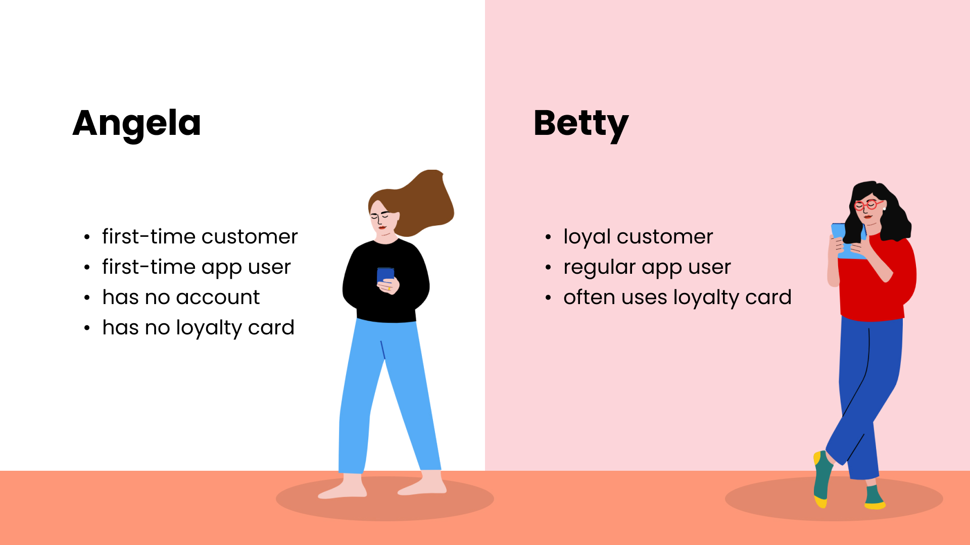
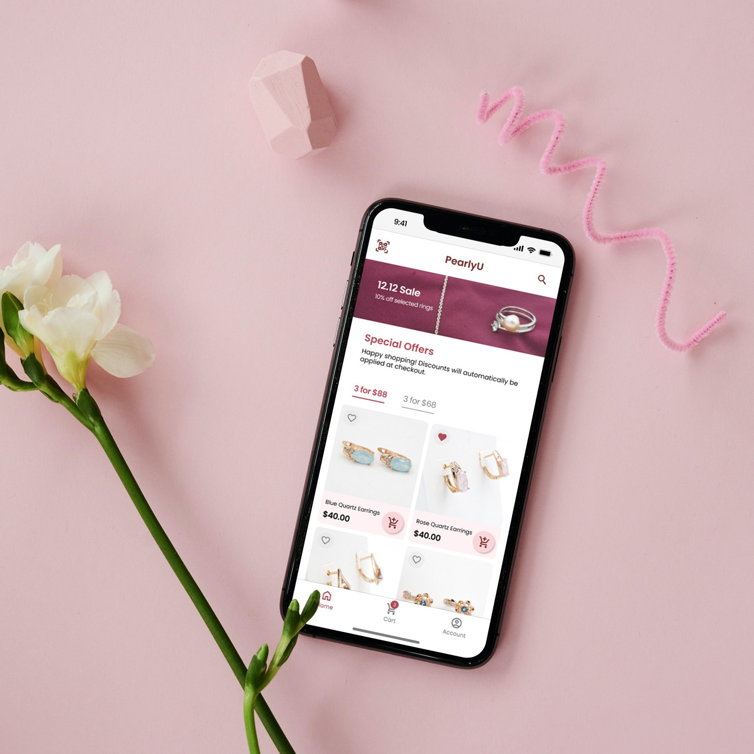
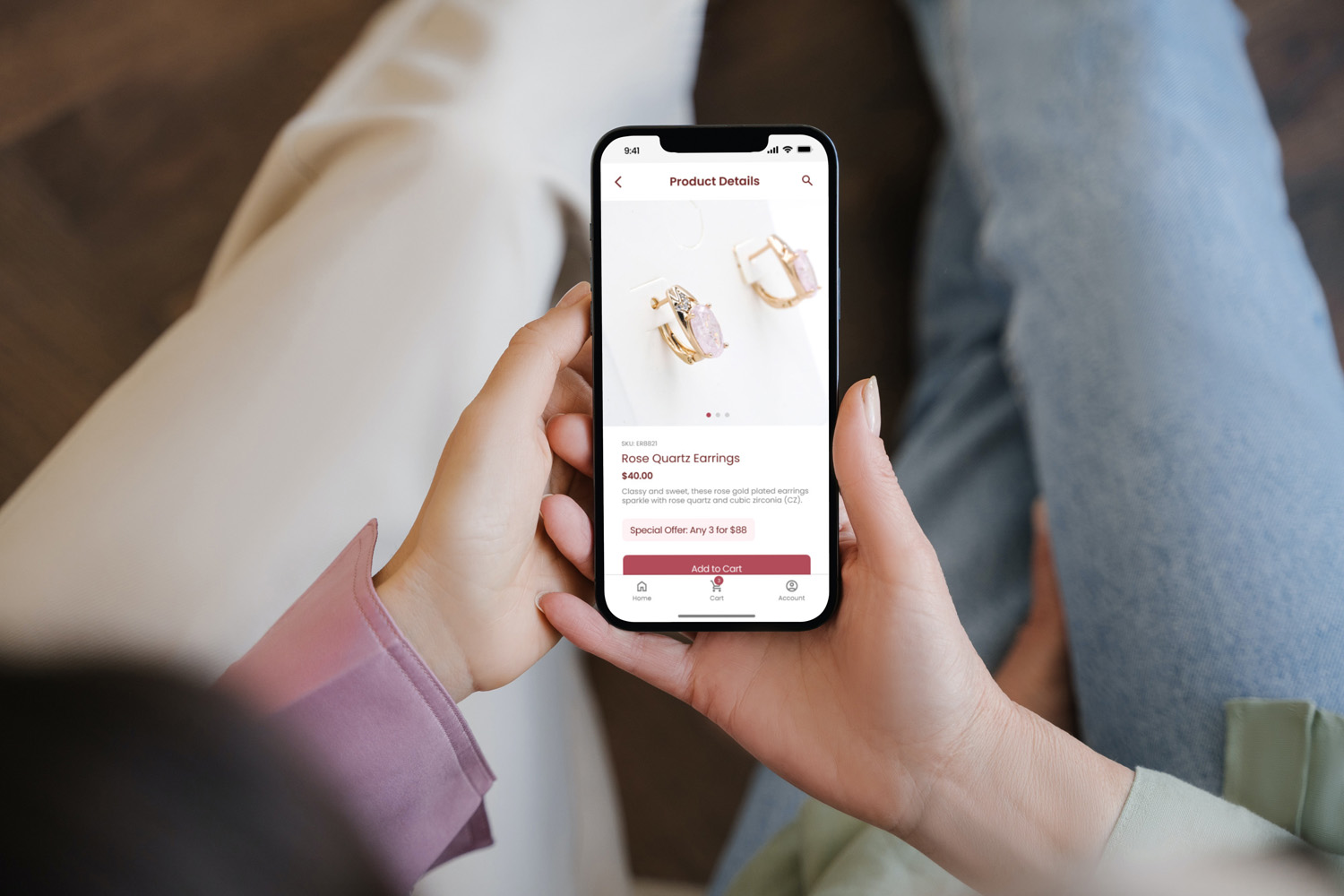
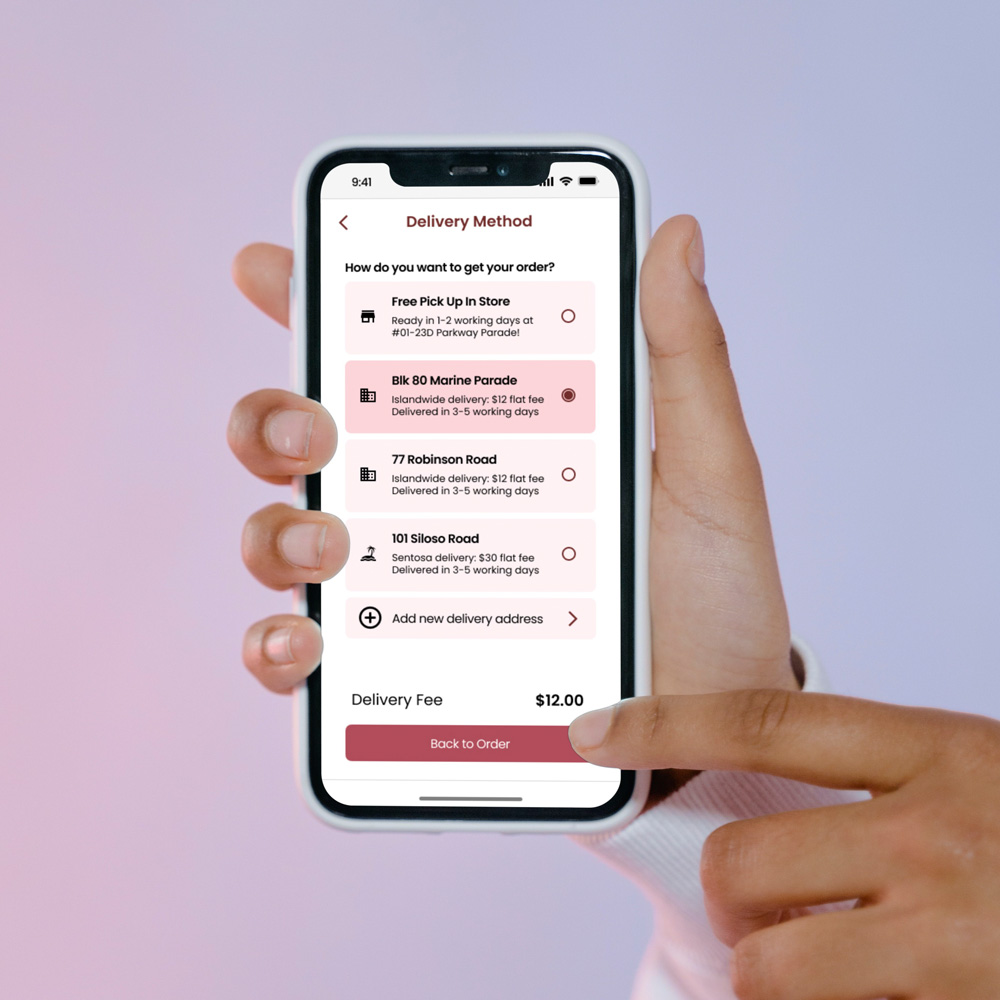
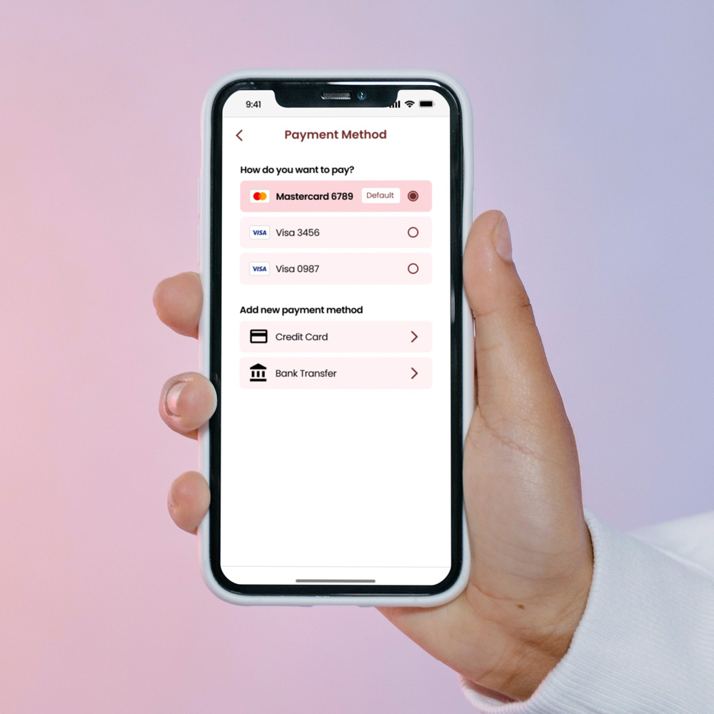
As all users would have a first time using the app, Angela’s shopping journey was still the main user flow: that of a new user buying jewellery remotely.
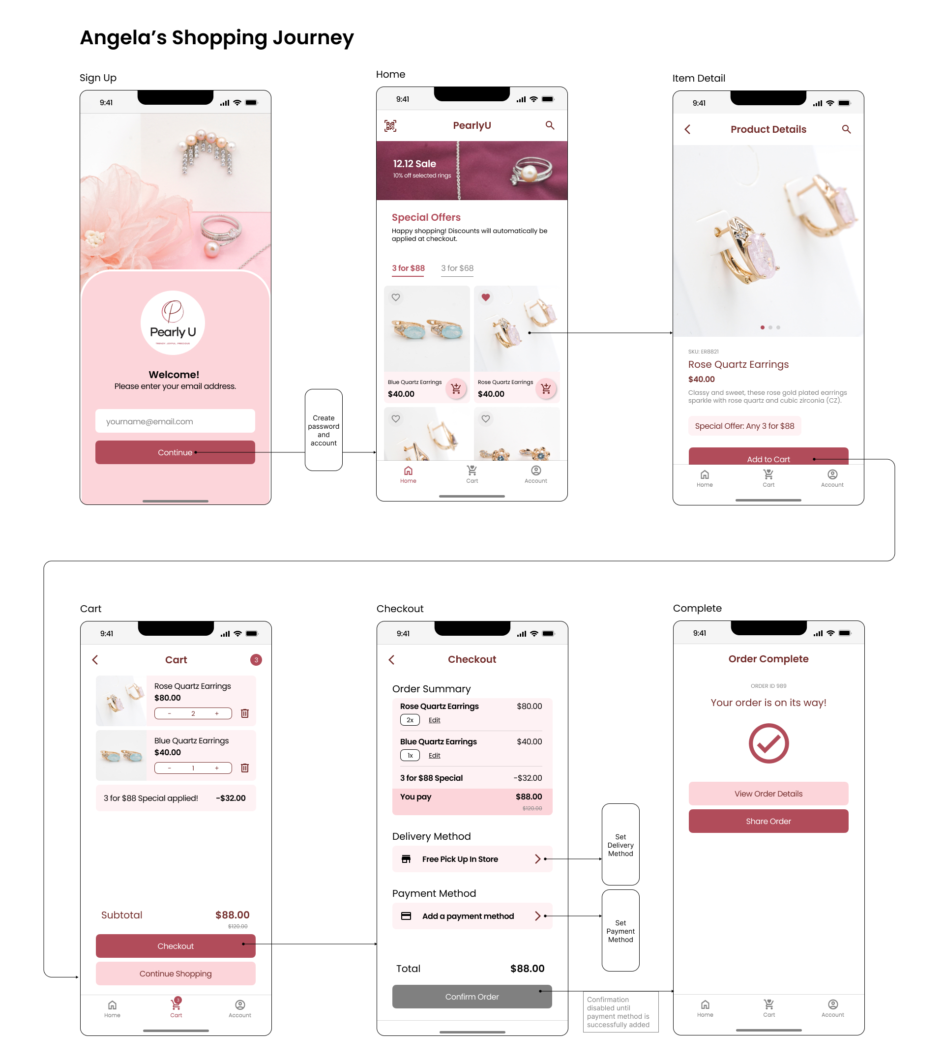
The above screens depict a happy path from opening the app to completing a purchase.
As the app aims to encourage repeat purchases (ie. convert Angela to Betty), the payment and delivery methods are moved to secondary screens, where the user saves her information and sets default preferences.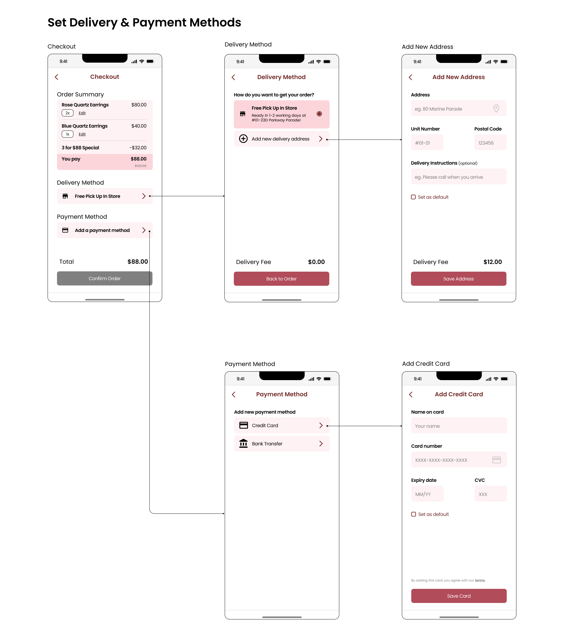
For her next purchase, Angela would have the convenience of a faster checkout.
If successful, first-time customers and loyal customers would become regular app users.
Behind-the-scenes work
As the first designer in a small business, I wore many hats.
I set up workflows, documented best practices, and automated spreadsheets for over 500 products.
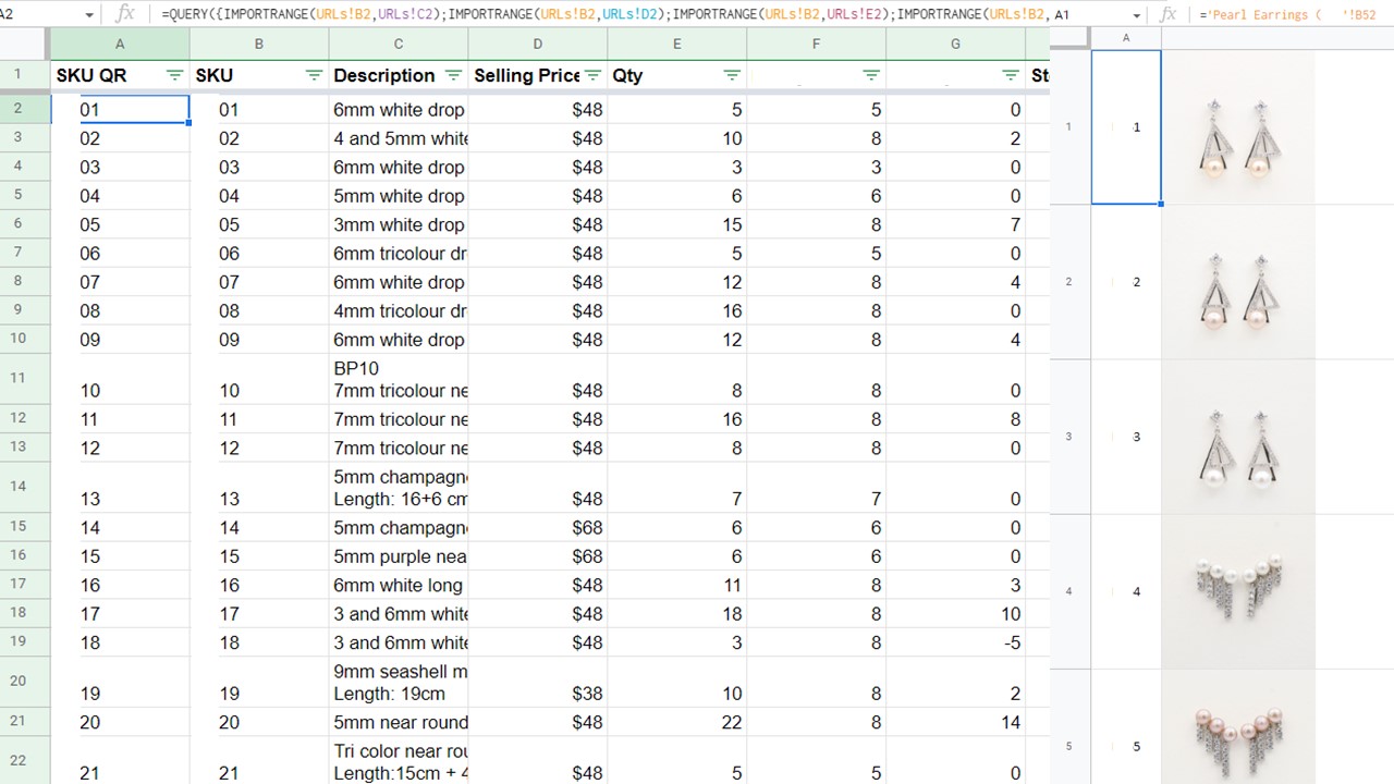
I reduced 4 different inventory outputs to 1, and consolidated digital content from 5 different locations to 1. Because of this, the business owner was amazed that he could update the catalog in record time!
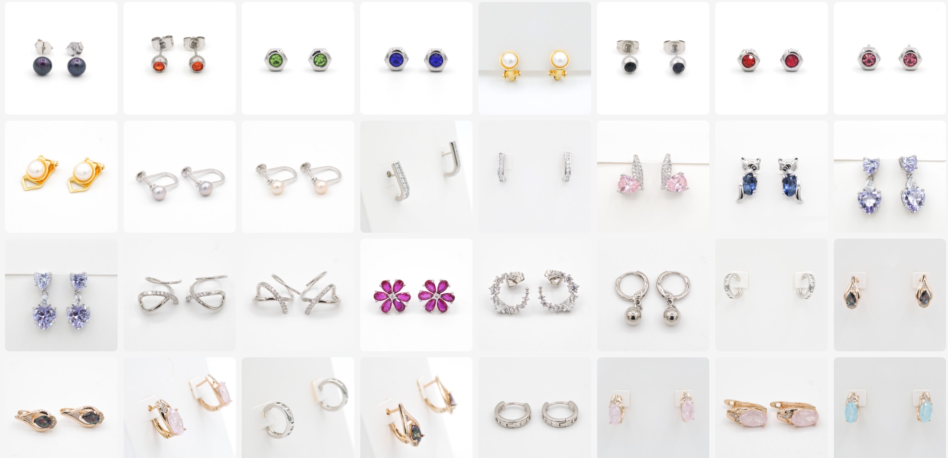
As product photography was needed, I also photographed over 200 products.
Getting my hands dirty gave me a thorough understanding of retail operations, and the chaotic interface between physical stock and digital records - valuable context to design.
Takeaways
Speaking the same language is essential. Busy businesspeople have one set of priorities, and developers have another: code-switching is needed!
To that end, the high-fidelity prototype I developed greatly facilitated design development and alignment between the business owners and development team.
Clear thinking is simple, direct, and effective. Simplicity is key, not only to smooth user flow and clean UI, but also in communication.