Establishing a Classical Pianist's Online Presence


Overview
My client, a classical pianist, wanted to establish her personal brand online.
I helped consolidate all her musical material in a website, which she would be able to manage herself using an intuitive, no-code editor. I also conducted a photoshoot with her to create essential visual content for her site.
Context
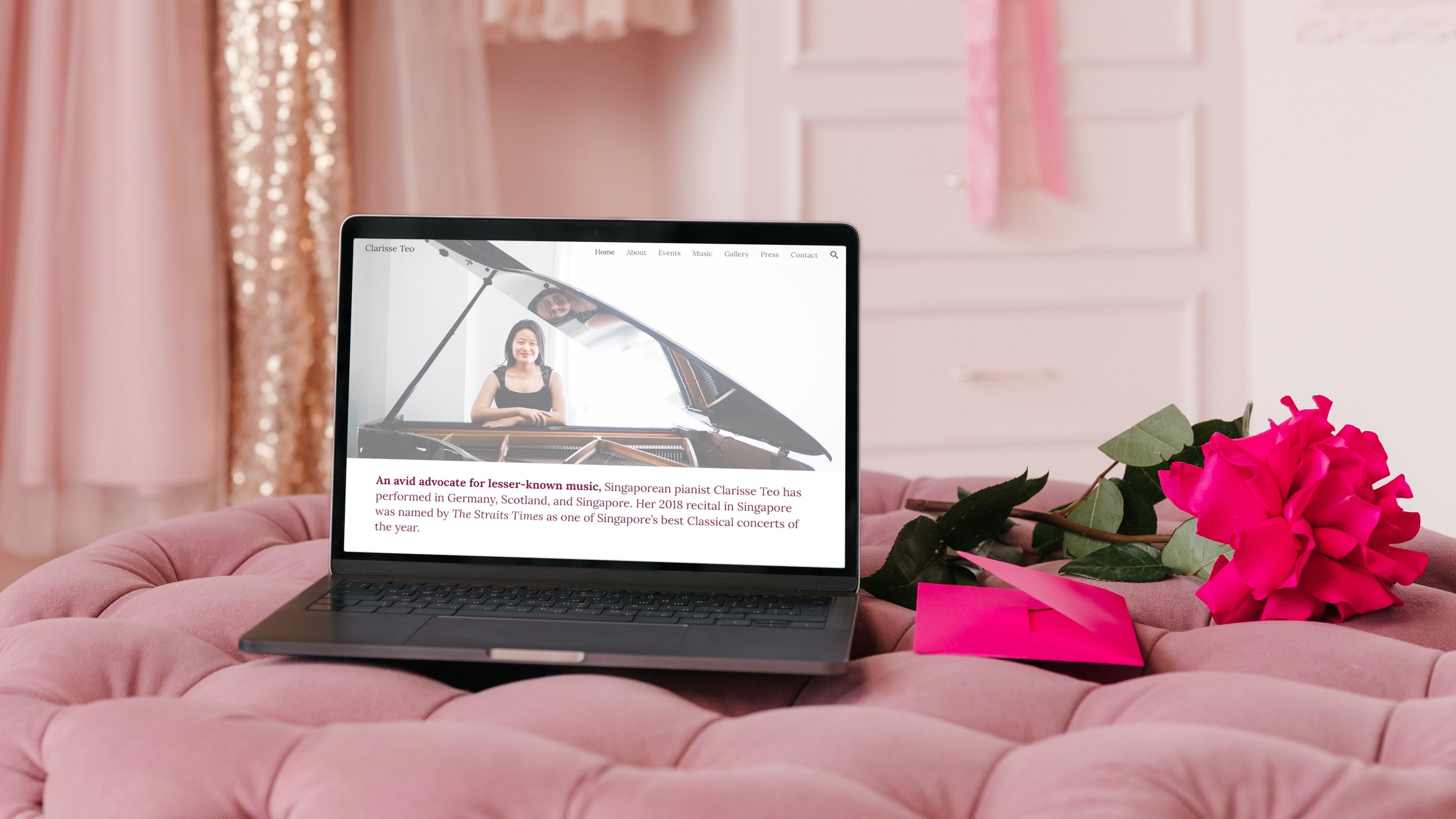
Even with her professional social media accounts, YouTube channel, and Spotify artist page, there was no single platform with a holistic overview of Clarisse’s practice as a classical pianist.
This website would house her performances, recordings, professional photographs, news features, and biography. It would be easily accessible to media, devoted fans, or anyone with an interest in classical music.
Existing Constraints
Three barriers had prevented her from making a website herself: technical knowhow, cost, and time. She didn’t code, she was hesitant about committing to a hefty paid subscription, and, as a musician, she wanted to focus on making music.
I priotized solutions that were quick and involved minimal cost, to get her website up and running as soon as possible, and for it to remain a sustainable long-term solution. Ideally, she should also be able to update her website easily.
Outcome
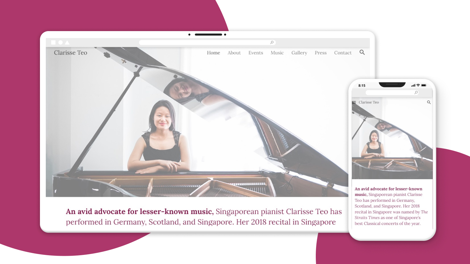
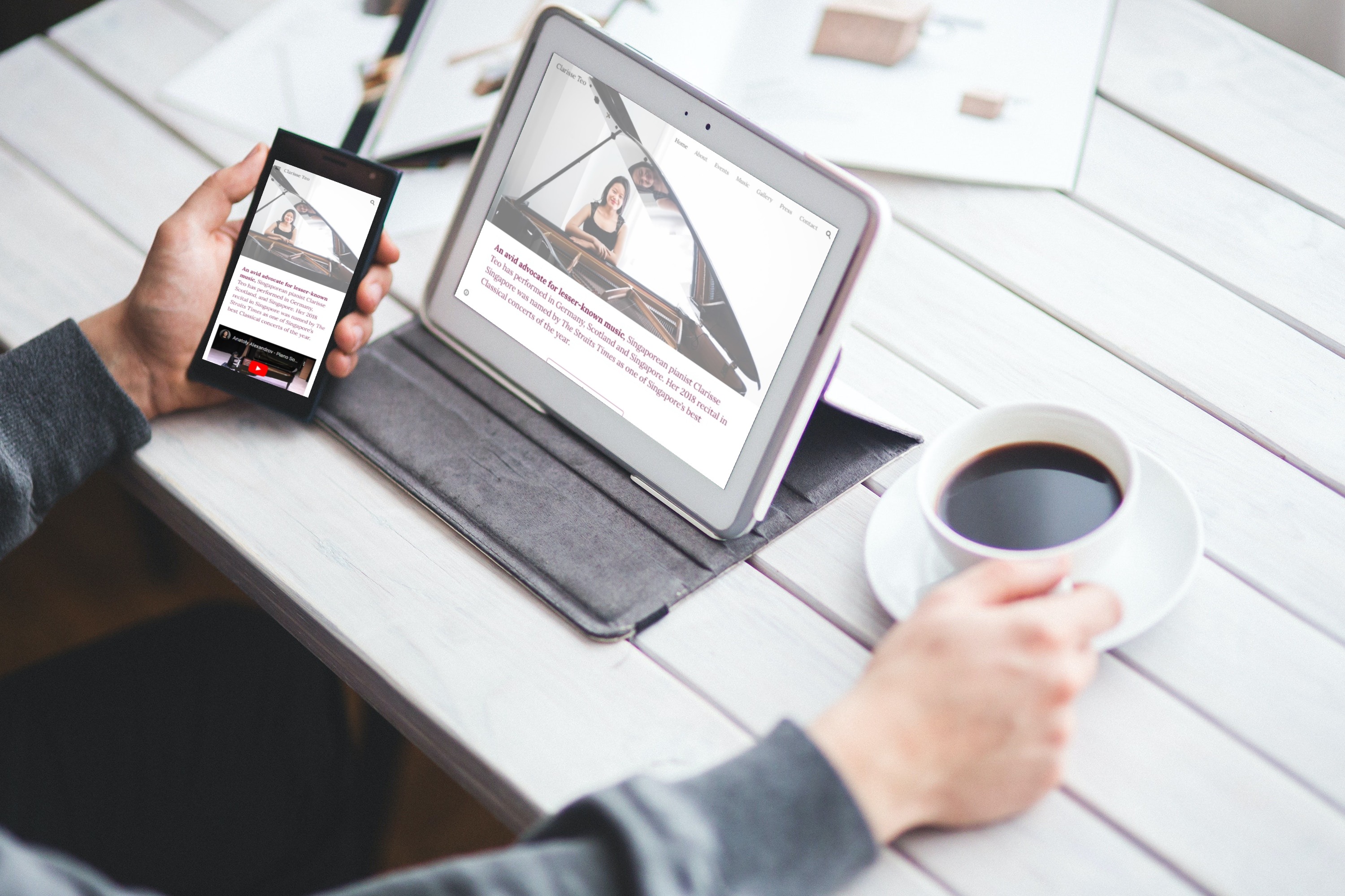
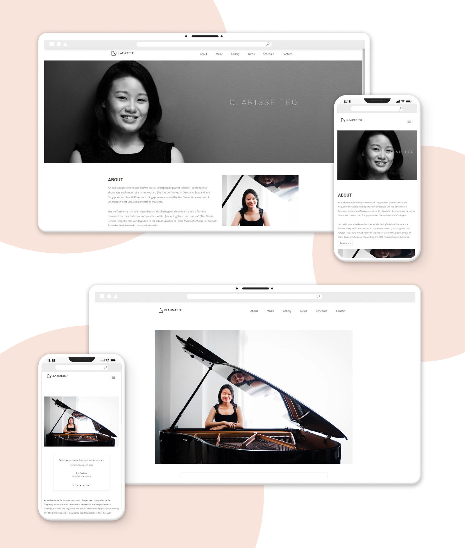
After some iterations, these two considerations eventually led to her website being built with the new Google Sites, resulting in a fully responsive site and an intuitive, no-code editor.
The only cost would be that of purchasing a custom domain, which would be required regardless.
Check out Clarisse’s website here!
Testimonial
Here’s what Clarisse had to say:
“Charisse was very responsible and responsive. She listened attentively and researched what layout and design would best suit my needs. Her recommended choices were also user-friendly and aesthetically pleasing, and allowed me to continue working on my website after the handover.”
Process: Content Planning
With the relative simplicity of a portfolio site, the main design decisions to be made were about information architecture: what information was available, and how would it be organised?
To learn established conventions, I diagrammed simple sitemaps of 6 other pianists’ websites, focusing on primary navigation categories.
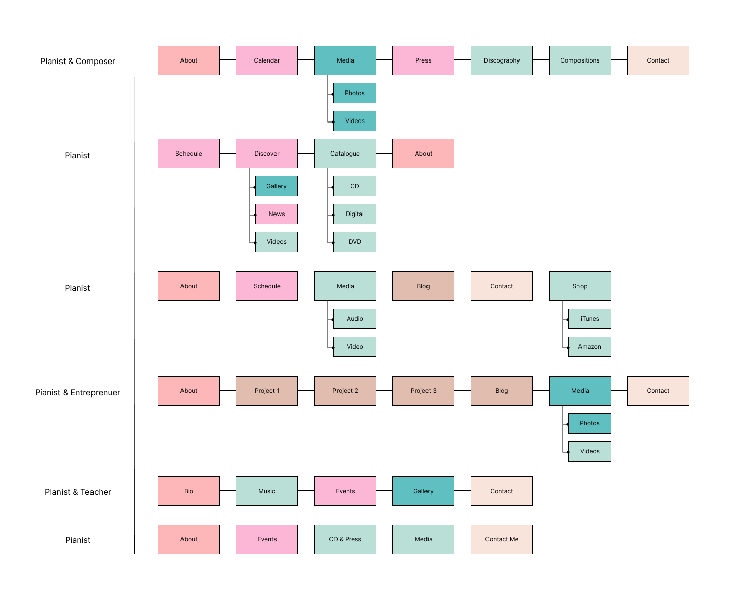
Colour-categorization made these major themes apparent:
- About: a biography, primarily text, sometimes with photos or quoted praise
- Performance Updates: Schedule, Events, Calendar, Press, News
- Music: Recordings, Audio, Video, Catalogue, CD, Discography, Compositions - the core musical work, involving different media
- Promotional Images: Photos, Gallery - professional photographs for media use
- Contact: a contact form, email, or agency representation
- Extras: a blog or personal projects
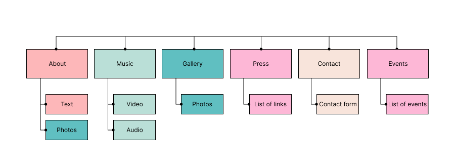
These categories informed the sitemap of Clarisse’s website, with further discussions and iterations:
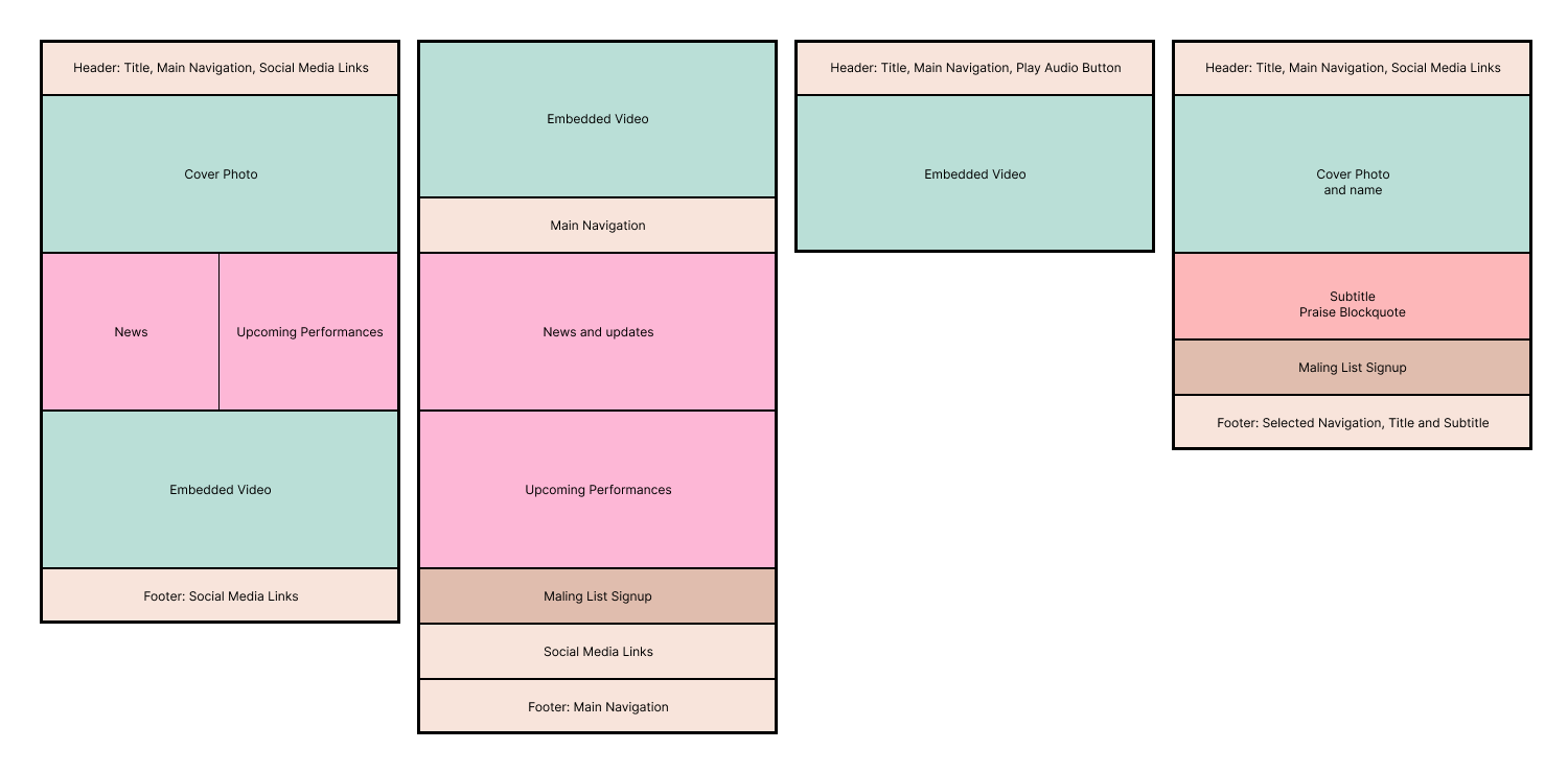
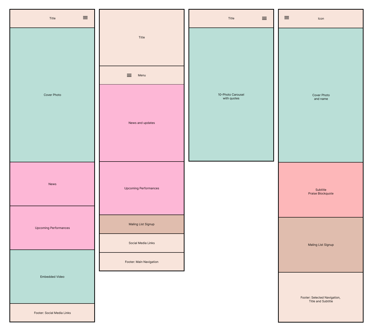
Diagramming homepage layouts on desktop and mobile made it clear that a large splash image or video was commonly the first thing viewers would see, followed by news of upcoming performances or quoted praise. Without a large number of upcoming performances, it made sense to feature a timeless introductory paragraph with praise - a plus point, as it would not neccesitate frequent updates in the future.
Initial Prototyping in Jekyll
My first thought was to create her website using Jekyll, Github’s static site generator, having used it for myself in the past. This was a promising start, with an existing theme doing most of the heavy lifting, after which I customised individual pages.
In using Jekyll, my priority was to get a site up and running quickly, and for free. Those were met.
However, development was time-consuming, and Clarisse would not be able to directly edit the site herself, making any handover pretty challenging.
Google Sites
Though many website builders exist, most tend to be expensive, and free plans feature obtrusive branding. I’d found that Google Sites offered a nice middle ground, and decided to give it a shot.
Within a single night, I’d made a complete version of the site with all its pages, and uploaded all media content.
These were major plus points that sped things up considerably:
- built-in responsive design and preview feature for different devices
- intuitive, no-code user interface, similar to Google Docs or Google Slides
- ability to change themes, theme colours, and fonts instantaneously
After a number of iterations, and a short onboarding session, the site is where it is today, and Clarisse has the knowhow to edit it as and when she wants.
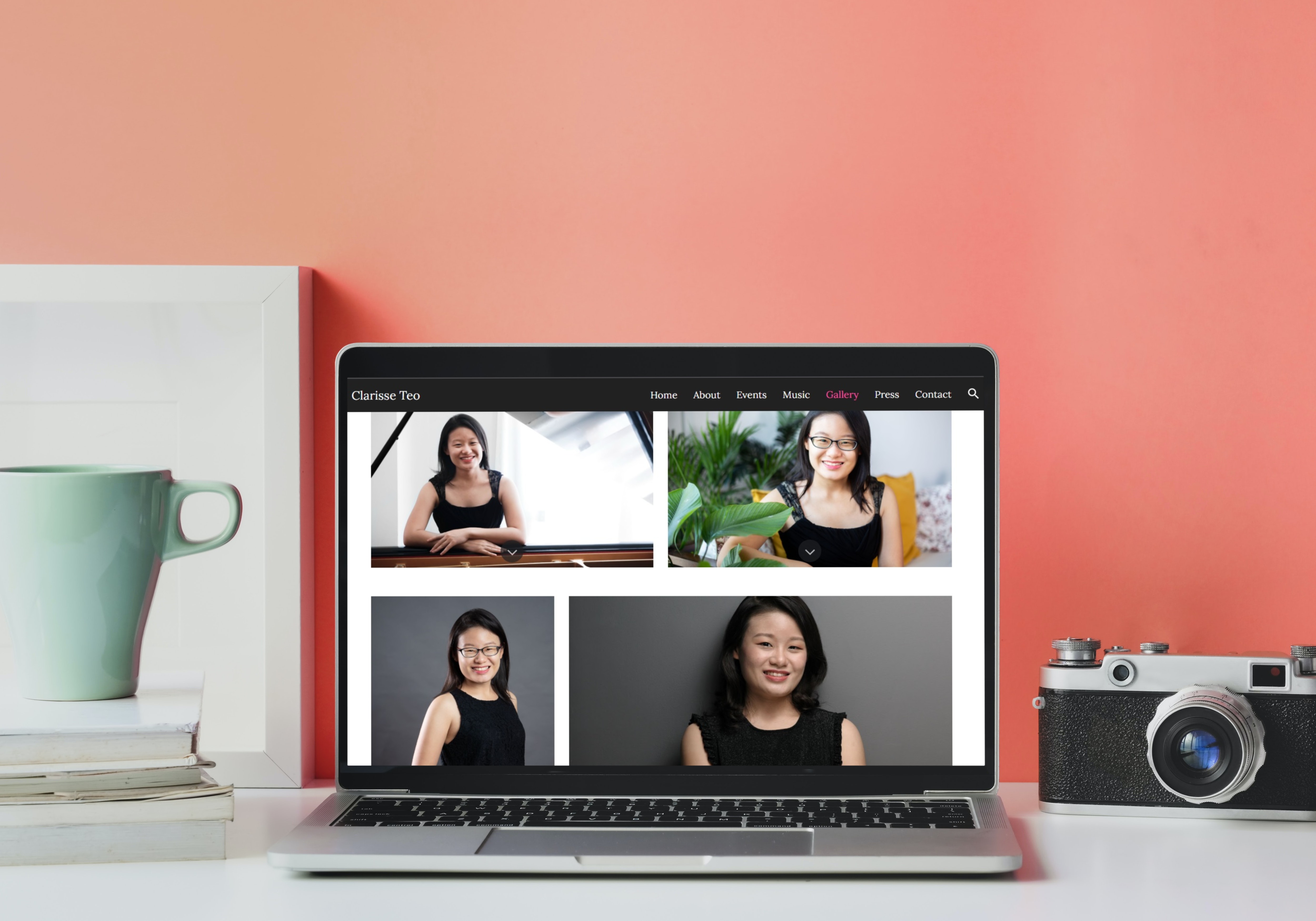
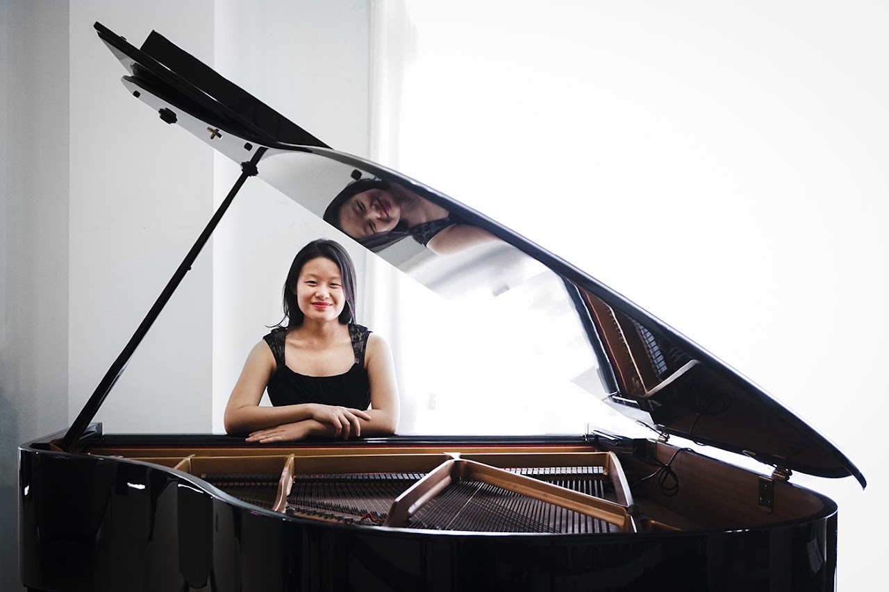
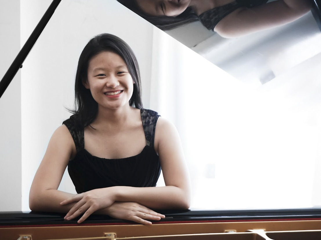
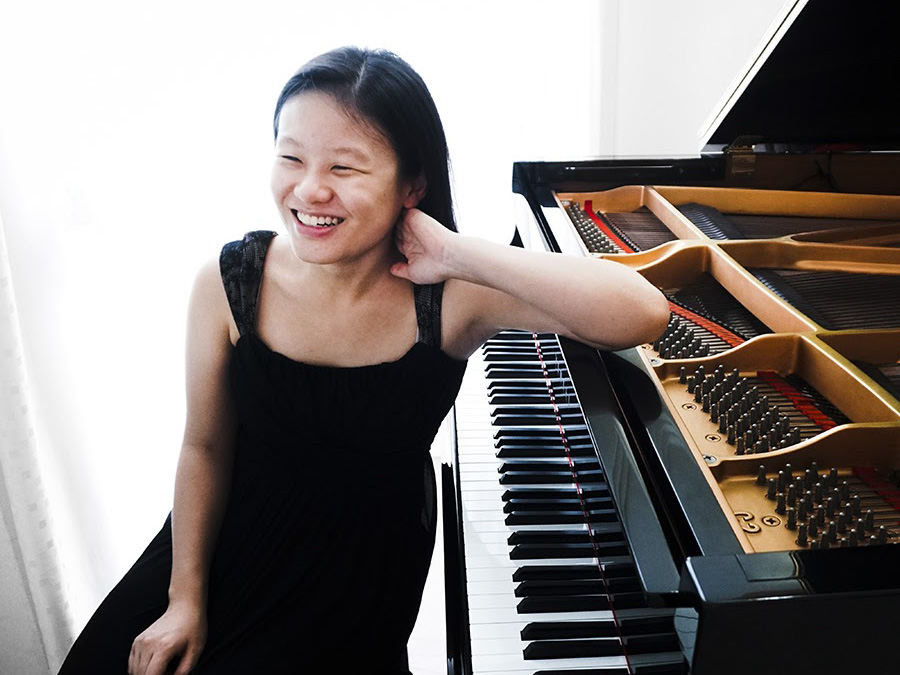
Extra: Photography
As a pianist, Clarisse needed photographs of herself with a piano, but only had professional headshots. We arranged a photoshoot where I photographed her with a grand piano.
Conclusion
As I was designing and building concurrently, design was often informed by technical considerations and limitations. Platforms such as WordPress.org were an early consideration, and one which I’d love to explore in the future. As a key consideration was that Clarisse would be able to update her site easily, the current solution seems to strike the sweet spot betweeen convenience and price.